It was Christmas 2016, and I felt like I had bitten off more than I could chew. I’m not talking about turkey, though. Four months into my PhD, I was feeling completely overwhelmed and starting to wonder what I had gotten myself into.
The goal of my project is to identify the pathways that sand takes as it moves in and around the Wadden Islands in the northern part of the Netherlands. Since the Dutch coast has a chronic erosion problem, accurately accounting for the whereabouts of their sand is a matter of national security. Right now, the Dutch deal with a deficit in their coastal sediment budget by adding more sand or “nourishing” wherever there is a shortfall.
Knowing when, where, and how much sand to add is especially challenging around these islands. Here, the persistent push and pull of the tide competes with the chaotic brutality of the waves to move sediment in complex patterns. These patterns are hard to predict with our usual box of tools, so we planned to throw everything we had at the problem: state-of-the-art field measurements, sophisticated computer models, reams of historical data, and a support team of experts from across the Netherlands. As PhD students go, I felt [and still feel!] pretty darn lucky to be a part of such a large and well-conceived project.
The Spaghetti Problem
However, as I started reading more and more about my topic, my initial enthusiasm began to wane. I was floored by just how much research had already been done on what I had thought was a fairly specific niche. The Dutch have been scrutinizing their coast for centuries, and to my inexperienced eyes, it seemed like they had already thought of everything.
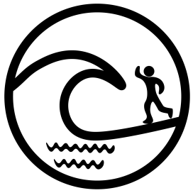
There was another problem: at the end of almost every study about sediment pathways, there seems to be a diagram summarizing all the paths with lots of curvy arrows flying all over the place. This veritable plate of spaghetti makes for a nice conceptual drawing, but how can you statistically compare two plates of spaghetti with one another? A “past spaghetti” and a “future spaghetti”, to help understand potential responses to climate change? A “Dutch spaghetti” and an “American spaghetti”, to make my findings more general and useful for other places? If I was going to get anywhere with my PhD, I needed a spaghetti system.

But: new year, new start. On January 11th, 2017, my first day back in the Netherlands from holidays, a paper about coral reef hydrodynamics popped up in my Google Scholar alerts. At that time, I was also finishing up a paper about predicting floods on tropical islands, and I liked to keep an eye on the latest developments in that topic.
“A coupled wave-hydrodynamic model of an atoll with high friction: Mechanisms for flow, connectivity, and ecological implications“. Sounds promising, I like wave models.
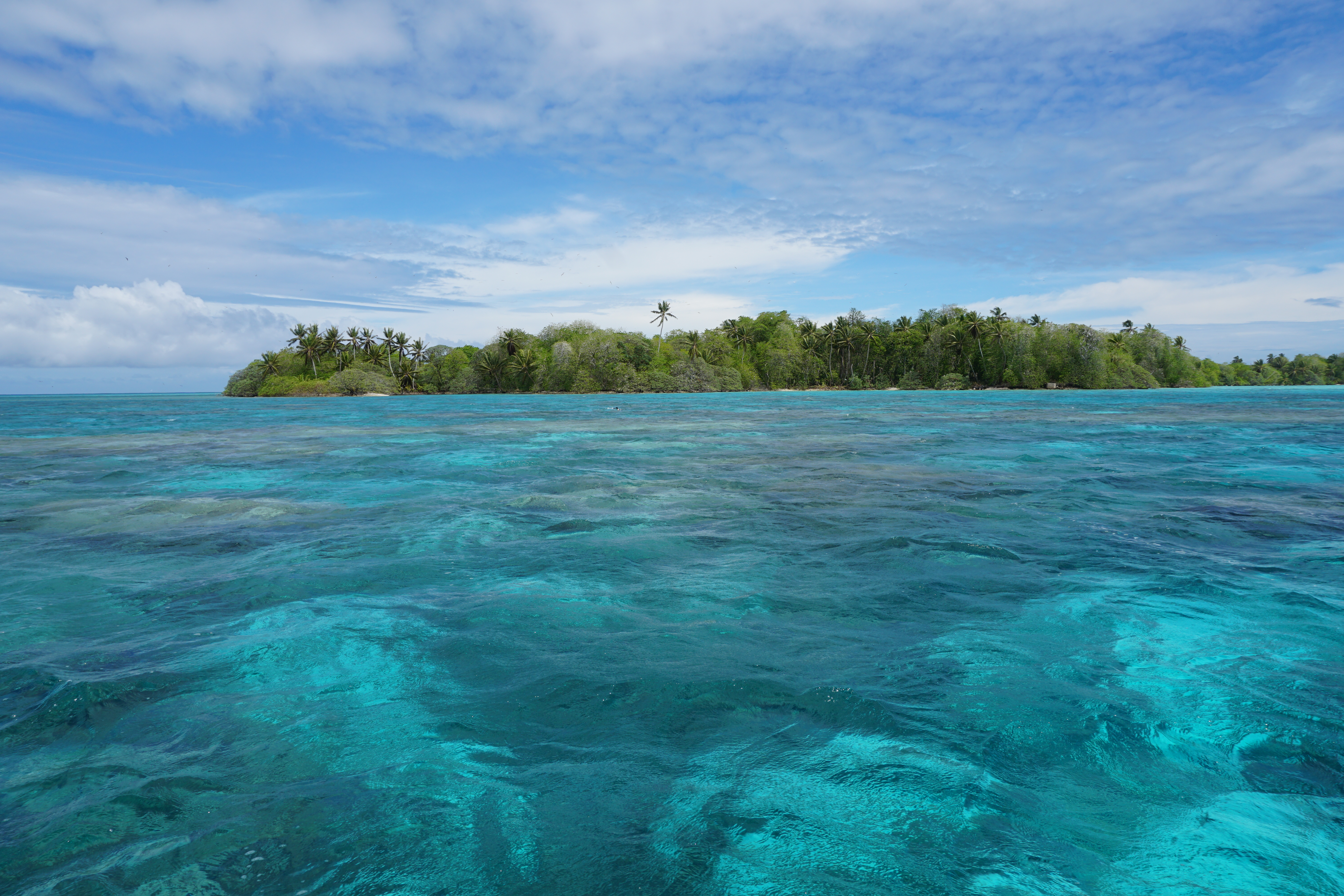
In this paper, they wanted to understand how waves and ocean currents move water around Palmyra Atoll, a coral island in the middle of the Pacific. Coral reefs all around the world are in big trouble, and to help them we must first understand the physical processes governing the life and death of corals.
The Magical Figure That Singlehandedly Changed My PhD…
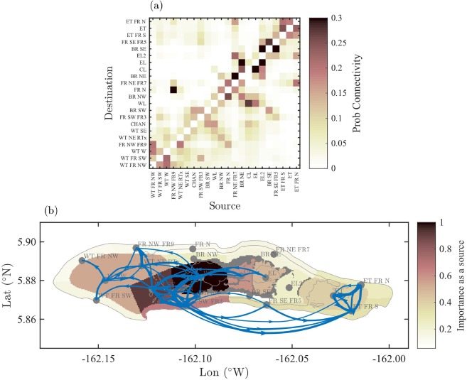
Essentially, the authors had summarized the pathways that coral larvae can take around an island in a mathematically elegant way. This was pretty much identical to the goal of my PhD, if you substitute coral larvae for sand, and an idyllic Pacific island for a stormy estuary in Holland. They did it with a concept called “connectivity”, and it became immediately apparent that I had some homework to do.
So what the heck is connectivity?
So what exactly do they mean by connectivity, and how are we meant to interpret that magical diagram? Let’s start at the top. The upper panel is what we call an “adjacency matrix”, but you can think of it just like one of those mileage charts that you sometimes see in the corner of highway maps.
The second panel shows the same information as the matrix, but this time actually showing the connections on a map – a “network diagram”. The thickness of the blue lines on the network diagram indicate how strong a connection between two points is. If all this seems rather familiar, then that’s probably because you’ve already met our network diagram’s more famous cousin, the transit map:

Cool maps. So what?
After seeing the coral reef connectivity diagram, I started googling and soon realized that I had been woefully ignorant of an entire mathematical discipline. Network theory represents complex systems as a series of points and the links between them. Once you’ve done that, interesting patterns start to emerge, such as the “six degrees of separation” or “small-world” phenomenon. It has been used in neurology, sociology, ecology, epidemiology, geomorphology, and basically every kind of “-ology”, except for coastal science and engineering. As far as I can tell, we seem to be the last ones to the party.
The more I read, the more excited I became, and the more vital it seemed for our field to catch up. Connectivity could help us quantify and bring order to the chaotic spaghetti churned out by our models and measurements – if we could figure out how to adapt it.
The course of my PhD was changed instantly with the discovery of that figure. Not only did connectivity provide a potentially useful tool, but it jolted me out of my funk and got me excited about my PhD again. It was an important finding for my research but not a “eureka moment” where everything was suddenly solved- far from it. It has been a long uphill slog since then, but with the help of some very clever people, I think we have almost reached our first milestone. We presented our early findings at a conference in 2017, and right now we’re in the final stages of preparing a scientific article about our ideas. That paper will then have to survive the woodchipper of peer-review, so it may still be many months before my work sees the light of day. But I remain hopeful.
Would I have stumbled upon connectivity eventually, had I not seen The Magic Figure? Probably not if I had only stuck to reading papers about coastal sediment transport. This finding has shaped my attitude towards coastal engineering research- I believe that the next advances in our field will not come from developing a new bedload equation, but from adopting new tools and techniques from other disciplines. Not that we don’t need better bedload equations – I just don’t think I’m the guy to do it, and I think that we could all benefit from looking over the fence at our neighbours in other fields from time to time. As William Zinsser nicely put it:
“Think flexibly about the field you’re writing about. Its frontiers may no longer be where they were the last time you looked.”
Sources:
Rogers, J. S., Monismith, S. G., Fringer, O. B., Koweek, D. A., & Dunbar, R. B. (2017). A coupled wave-hydrodynamic model of an atoll with high friction: Mechanisms for flow, connectivity, and ecological implications. Ocean Modelling, 110, 66-82.
Zinsser, W. K. (1989). Writing to learn (pp. 224). New York: Harper & Row.
