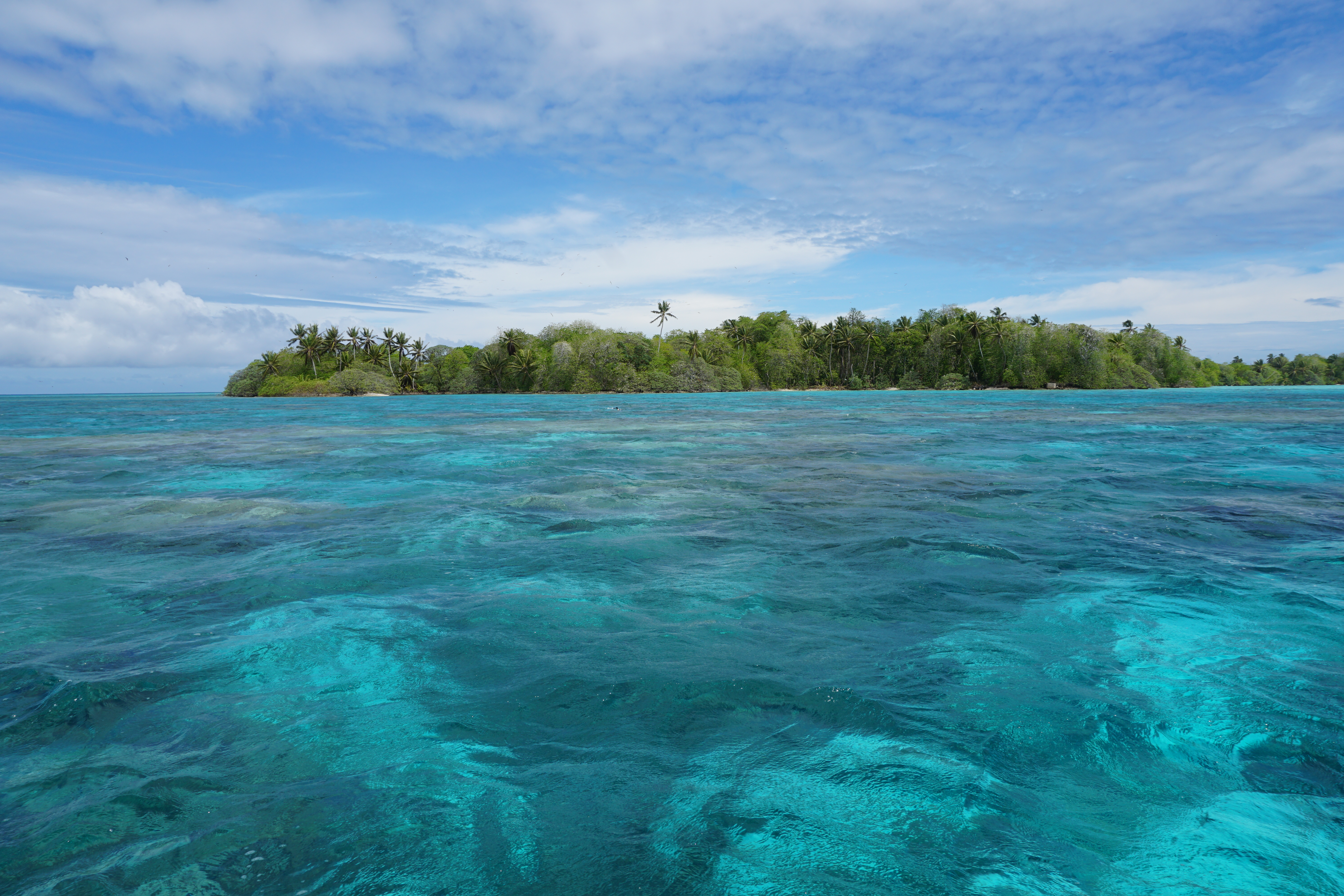
Large populations near the sea are vulnerable to coastal floods, making coastal safety and sustainability an urgent societal priority. This is especially true in the Netherlands, where over a quarter of the country lies below sea level, and the main protection from deadly coastal floods is a barrier of wide, high sandy beaches and dunes. However, this sandy buffer is constantly moving and chronically eroding. To plan effective future coastal adaptations, we need to know where that sand is coming from, going to, and which paths it takes to get there. I am delighted to share that I have just received a Veni grant from the Dutch Research Council (NWO) to investigate this!
Where is the sand on beaches going, and how does it get there?
My overarching goal is to enable effective sediment-based climate adaptation strategies for vulnerable coasts. To approach this, I consider coasts as an interconnected network of sediment pathways, like a subway map showing how stations are linked. This connectivity reveals the hidden structure underlying chaotic sediment pathways through coastal systems. These pathways are immensely difficult to identify on real coasts due to the challenge of tracking individual sand grains from multiple sources in such a dynamic environment.
Proof-of-concept connectivity analysis of a beach and harbour. (a) Map of tracer particles in example SedTRAILS model from 7 different source patches at a snapshot in time. (b) The number of particles (np) from a given source in each receptor is counted to yield a connectivity matrix, graphically represented by a connectivity network diagram (c).
To deal with this challenge, this grant will enable me to develop both a scale model in a physical laboratory and a numerical model in a digital laboratory. In a wave tank the size of an Olympic swimming pool, I will construct a beach from multi-coloured sand. As waves disperse the sand, the resulting rainbow of sediment will reveal their pathways, which I will then quantify as a network in the digital laboratory. The resulting open datasets and numerical models will serve as a benchmark for the coastal research community, generating new theories and improved tools. My collaborators in the Netherlands, US, and New Zealand will help me to implement these findings in research, engineering practice, and coastal management policy. In this way I hope to enable more effective management of sediment for coastal adaptation and a more holistic understanding of our coastal systems.
Stay tuned for more updates once the project begins!
How can we ensure that vulnerable coasts and deltas remain robust to the effects of climate change? We need to better understand how sediment moves along our coasts and deltas, and plan to do so by treating coastal systems as networks of interconnected sediment pathways.
We are looking for a curious and motivated PhD candidate to work with us on an exciting project here at TU Delft in the Netherlands. The main goal of this position is to develop novel approaches to quantify sediment pathways and connectivity, and to use these approaches to inform coastal sediment management.
Our main strategy for ensuring the climate-robustness of the Dutch coast is to nourish or place sand to widen its beaches and dunes. However, the fate of sand placed on the coast is still poorly understood in the context of the full coastal system. Understanding where nourished sand goes is necessarily rooted in understanding the natural sediment transport pathways and connectivity of the system. To take advantage of advances in the field of network analysis and extend these concepts to analyzing sediment transport pathways in coastal systems, we established the framework of coastal sediment connectivity (Pearson et al., 2020).
In this project, you will advance coastal engineering by introducing established techniques from other fields (e.g., network analysis) in a novel way to understand and predict sediment transport. These techniques will yield a new and useful toolbox of methods for predicting and understanding sediment pathways, and enable more efficient and effective nourishment design and execution. This will ultimately contribute to the robustness of the Dutch coast to climate change and the safety of its people against flood hazards.
In this PhD, you will:
Apply network analysis techniques to better understand how sediment pathways are connected at small/short and large/long space/time scales.
Use coastal sediment connectivity networks to probabilistically model sediment pathways via Markov chains or machine learning approaches.
Quantify (a)synchronization of coastal sediment networks and relate to hydrodynamic forcing.
Relate quantitative metrics of network structure to practical coastal management goals (eg, identifying resilience or tipping points).
At TU Delft, you will be part of the Coastal Engineering section where we combine research on hydrodynamics, morphodynamics, and human interventions to the coast using numerical modeling and field measurements. You will primarily work with me (Stuart Pearson) and Ad Reniers, embedded within a larger ecosystem of research partners.
Ebb-tidal deltas are gigantic piles of sand that form at the seaward mouth of tidal inlets. They are constantly on the move, shifting shape and size in response to the waves and tides. Where exactly is that sand going? This is a question I have been struggling with for the past 5 years during my PhD, and we have recently made great strides in part due to the efforts of Paula Lambregts.
Yesterday, Paula Lambregts successfully defended her master’s thesis, “Sediment bypassing at Ameland inlet“. I had the great honour of co-supervising Paula’s research throughout the last ten or so months, and I am enormously proud of her. Her project encompassed a range of approaches, including bathymetric analysis and numerical modelling, to solve the mystery of the sediment pathways.
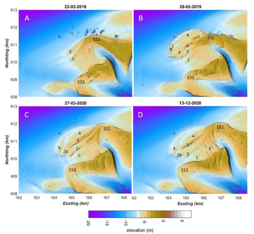
First, Paula’s detective work led her to examine detailed measurements of the seabed bathymetry at Ameland Inlet in the Netherlands, taken over the past fifteen years. These measurements give snapshots of the underwater delta landscape. By comparing the bathymetry from different months or years, we can track the delta’s evolution. In the image below, we see four snapshots of the ebb-tidal delta before and after the construction of a sand nourishment (i.e., the large pile of sand that appears in panel B). This nourishment was a large-scale pilot test to determine if creating sand deposits like this is a viable strategy for strengthening the coast of nearby islands.
Bathymetric maps showing Ameland Ebb-Tidal Delta before (A) and after (B,C,D) the construction of a massive sand nourishment. Paula’s analysis tracked how this nourishment evolved over time, smoothed and smeared out to the east and south east by the combined effects of waves and tides.
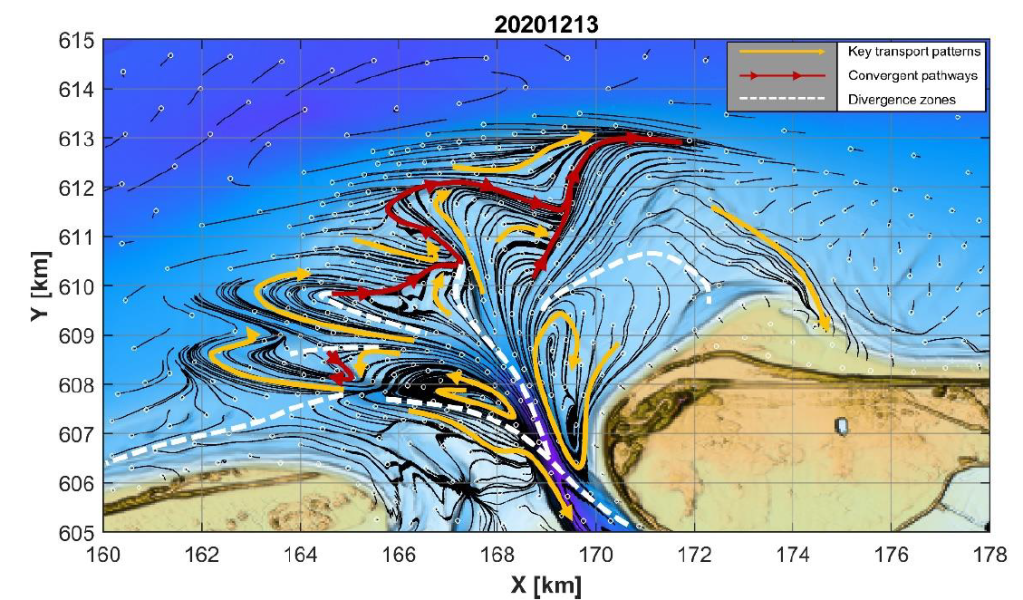
After describing how the delta has evolved in the past, Paula developed hypotheses about the physics underlying this behaviour- how do waves and tides move the sand around to create the patterns we observe? To answer this question, she used a combination of computer models to estimate sand transport pathways. This allows us to “connect the dots” and explain how the sand moved from one place to another. The first component was a D-Flow FM model, which is used to simulate the hydrodynamics (waves and tides) and sediment transport (where and how much sand moves). The second component of her modelling approach was to apply SedTRAILS, a brand-new tool developed by my colleagues and I at Deltares for visualizing predicting sediment transport pathways. Using SedTRAILS, she was able to create some really cool maps that indicate where the sand goes.
Sediment transport pathways on Ameland ebb-tidal delta in 2020, as visualized using SedTRAILS. The small white circles indicate the source locations of sediment, and thin black lines show the sediment pathways originating from those sources. The yellow lines highlight major transport pathways, and the red lines indicate convergent zones where multiple pathways meet. The white dashed lines indicate divergence zones, where the transport pathways veer away from and (on average) do not cross.
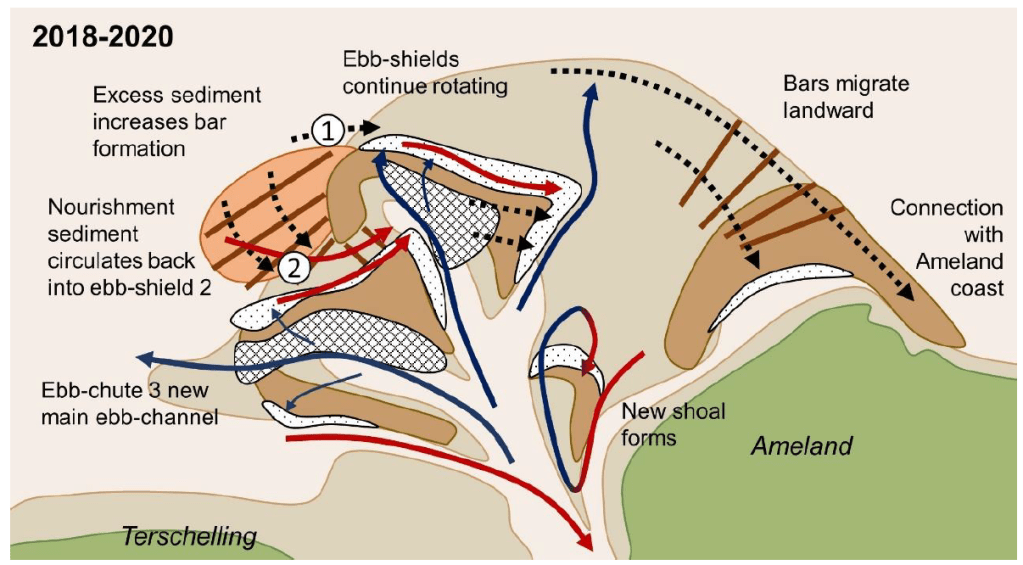
Drawing on her prior expertise in geology, Paula combined those two lines of evidence (the measurements of the seabed and the modelled sediment pathways), to come up with a series of fantastic conceptual diagrams. These diagrams distill the mysterious piles of sand and complex spaghetti of the images above into a more easily understandable picture:
Paula’s conceptual model summarizing all of the different processes shaping Ameland ebb-tidal delta in 2020. Check out her thesis to see the complete evolution over the past 15 years!
The work that she did is extremely valuable for coastal management, since it gives more insight into where (and where not!) to construct sand nourishments. It also brings new insights to science about how these complex systems work. Last of all, it is enormously helpful for the research that we are continuing to do at TU Delft and Deltares. In September I will continue on with the work on sediment transport pathways at tidal inlets begun during my PhD, and build on the work that Paula has carried out in her thesis project. I am extremely proud of her and hope that we can continue to collaborate in the future!
It has been a crazy year, but work-wise I am on the final stretch, at least. Tonight at the ungodly hour of 12am CET, I will present my poster at the American Geophysical Union conference. It is at a much more reasonable 3pm PST in California where the conference organizers are located. If you have registered for the conference, you can see the poster via this link. Otherwise, I will try to put you in the loop here.
Estuaries are complex environments shaped by the interaction of waves, tides, rivers, and humans. Understanding how sand and mud move through estuaries is essential for their effective management. In an approach known as connectivity, the pathways taken by sand and mud through estuaries can be represented as a connected network of nodes and links, similarly to a subway map. Connectivity provides numerous mathematical techniques and metrics that are well-suited to describing and comparing these pathways in estuaries.
Network diagrams depict the sediment transport pathways of each estuary as a series of nodes and connecting links. The Mouth of the Columbia River (1) and San Francisco Bay (2) are on the west coast of the United States, while Ameland Inlet (3) and the Western Scheldt (4) are in the Netherlands. Red arrows indicate the 90th percentile of all connections in terms of sediment fluxes, superimposed on greyscale bathymetry of each estuary.
We use connectivity to map out and analyze sand and mud pathways in four estuaries around the world: the Wadden Sea (the Netherlands), Western Scheldt (NL), San Francisco Bay (US), and Columbia River (US). Our analysis is based on the outcome of numerical simulations, and we explore the benefits of different simulation techniques. We conclude that connectivity is a useful approach for visualizing and comparing the pathways that sand and mud takes through different estuaries. We can use this method to plan and predict the impact of human interventions in these environments, such as dredging.
However, a comparison of connectivity metrics suggests a dependency not just on sediment transport processes, but also on the choices made in schematizing networks from underlying models. Essentially, we’re not comparing apples to apples yet, so if we are going to make comparisons between different estuaries, we need to make sure that we set up our models in an equivalent way. Our ongoing research will focus on optimizing these numerical models to make more meaningful quantitative comparisons of different estuaries.
What’s it about? As sand moves along coasts and through estuaries, the pathways it takes are determined by a complex combination of waves, tides, geology, and other environmental or human factors. These pathways are hard to analyze and predict using existing approaches, so we turn to the concept of connectivity.
What is connectivity? Connectivity represents the pathways that sediment takes as a series of nodes and links, much like in a subway or metro map (see here for a primer). This approach is well used in other scientific fields like neurology, oceanography, and fluvial geomorphology, but in our study we apply these techniques to coastal sediment dynamics.
So what? To show how the sediment connectivity approach can be used in practice, we map sediment pathways with it at Ameland Inlet, an estuary in the Netherlands. The statistics we compute using connectivity let us quantify and visualize these sediment pathways, which tells us new things about the coastal system. We can also use this approach to answer practical engineering questions, such as where to place sand nourishments for coastal protection. We hope to use sediment connectivity to predict the response of our coasts to climate change, and the human adaptations that these changes provoke.
A conceptual summary of our paper on sediment connectivity at Ameland Inlet in the Netherlands.(a,c) We can schematize the sediment transport pathways in an estuary as a series of nodes (A,B,C,…) and the links connecting them. (b) This network can in turn be represented by a matrix, showing where the sediment is coming from (a source) and where it’s going to (a receptor). In this form, we can investigate questions like, “where does the sand in node F go?” (d), or “where does the sediment reaching node D come from?”(f). In my research, we are most interested in answering questions like, “what is the main pathway between the two islands, node A and G?” (e). We can also learn how the system is organized into “communities” that share sand (g), and how that changes when pathways are added or removed (h).
It has been a long journey, beginning with The Magical Figure that Changed My Entire PhD and now culminating in this publication. I am especially indebted to my supervisors, Bram van Prooijen and Zheng Bing Wang, for their constant support. I am also grateful to my other co-authors, Edwin Elias from Deltares and Sean Vitousek at USGS, for seeing potential in this approach and really strengthening and clarifying my story. I was also blessed with curious and constructive reviewers who provided a much-needed non-engineering perspective on our work.
Now that this paper is out, the fun can really begin! I have lots of fun ideas for applying connectivity to other estuaries around the world including the Mouth of the Columbia River and San Francisco Bay. We are also in the process of developing new modelling tools that well help us better unravel how estuaries and coasts are connected. Stay tuned!
Sources:
Pearson, S.G., van Prooijen, B.C., Elias, E.P.L, Vitousek, S., & Wang, Z.B. (2020). Sediment Connectivity: A Framework for Analyzing Coastal Sediment Transport Pathways. Journal of Geophysical Research: Earth Surface. [Link]
What pathways does sediment take as it travels through an estuary? Yesterday, Laurie van Gijzen defended her thesis, entitled “Sediment Pathways and Connectivity in San Francisco South Bay“. Laurie is one of the master’s students that I supervise, and she has done a great job on this project.
San Francisco Bay is a massive estuary, with over six million people living nearby. In addition to San Francisco, Silicon Valley sits on its shores. Some of the biggest tech companies in the world like Google and Facebook have their head offices right next to the Bay. For over 150 years, the ecological health of the bay has deteriorated, in part due to land reclamations and contaminated sediment from gold mining. The dynamics of San Francisco thus have a huge economic, social, and environmental impact.
Laurie’s work focused on calibrating and improving a sediment transport model of the bay, in order to track the pathways of fine sediment (i.e., mud). She worked with a notoriously fickle model (DELWAQ) and succeeded in greatly improving its calibration.
Laurie’s thesis summarized into a single diagram (Figure 6.1 from her report). She shows the dominant sediment pathways as dark arrows, and the net accumulation (import, in orange) or depletion (export, in blue). Also indicated are the dominant physical processes responsible for sediment transport in the different parts of the bay. The baroclinic processes mentioned here are currents resulting from density differences in seawater due to changes in salinity and temperature.
Another cool thing about her work is that Laurie was the first person to apply the coastal sediment connectivity framework that I have been developing! She was able to use this to identify key transport pathways and critical locations in the bay. It was extremely helpful for my research, as it gives us a proof of concept that our framework is applicable to multiple sites and can tell us something useful.
Her work was also accepted for a presentation at the NCK Days conference, which was meant to be held this week in Den Helder, but was cancelled due to ongoing societal chaos. Great job, Laurie!
It was Christmas 2016, and I felt like I had bitten off more than I could chew. I’m not talking about turkey, though. Four months into my PhD, I was feeling completely overwhelmed and starting to wonder what I had gotten myself into.
The goal of my project is to identify the pathways that sand takes as it moves in and around the Wadden Islands in the northern part of the Netherlands. Since the Dutch coast has a chronic erosion problem, accurately accounting for the whereabouts of their sand is a matter of national security. Right now, the Dutch deal with a deficit in their coastal sediment budget by adding more sand or “nourishing” wherever there is a shortfall.
Knowing when, where, and how much sand to add is especially challenging around these islands. Here, the persistent push and pull of the tide competes with the chaotic brutality of the waves to move sediment in complex patterns. These patterns are hard to predict with our usual box of tools, so we planned to throw everything we had at the problem: state-of-the-art field measurements, sophisticated computer models, reams of historical data, and a support team of experts from across the Netherlands. As PhD students go, I felt [and still feel!] pretty darn lucky to be a part of such a large and well-conceived project.
The Spaghetti Problem
However, as I started reading more and more about my topic, my initial enthusiasm began to wane. I was floored by just how much research had already been done on what I had thought was a fairly specific niche. The Dutch have been scrutinizing their coast for centuries, and to my inexperienced eyes, it seemed like they had already thought of everything.
There was another problem: at the end of almosteverystudyaboutsedimentpathways, there seems to be a diagram summarizing all the paths with lots of curvy arrows flying all over the place. This veritable plate of spaghetti makes for a nice conceptual drawing, but how can you statistically compare two plates of spaghetti with one another? A “past spaghetti” and a “future spaghetti”, to help understand potential responses to climate change? A “Dutch spaghetti” and an “American spaghetti”, to make my findings more general and useful for other places? If I was going to get anywhere with my PhD, I needed a spaghetti system.
Mmm, sediment pathways… Also, to be clear, this is not The Magical Figure That Single-handedly Changed My PhD. [Source: Flickr]By Christmas, I felt like I was in a weird purgatory between “it’s all been done before! I’ll never come up with anything original!” and “this is insurmountably complex and you’re foolish to think you’ll ever figure this out”. And just a dash of “how-did-I-get-here?” imposter syndrome, for good measure. I spent much of my holiday feeling overwhelmed and inadequate, like I couldn’t possibly live up to my own expectations, or (what I thought to be) the expectations of those around me.
But: new year, new start. On January 11th, 2017, my first day back in the Netherlands from holidays, a paper about coral reef hydrodynamics popped up in my Google Scholar alerts. At that time, I was also finishing up a paper about predicting floods on tropical islands, and I liked to keep an eye on the latest developments in that topic.
“A coupled wave-hydrodynamic model of an atoll with high friction: Mechanisms for flow, connectivity, and ecological implications“. Sounds promising, I like wave models.
In this paper, they wanted to understand how waves and ocean currents move water around Palmyra Atoll, a coral island in the middle of the Pacific. Coral reefs all around the world are in big trouble, and to help them we must first understand the physical processes governing the life and death of corals.
Palmyra Atoll, a coral island in the middle of the Pacific. Unfortunately not my PhD study site… [Source: Wikipedia]This was all very interesting stuff, though not particularly relevant to my research about flood prediction, since they seemed more focused on the ecological impact of their results. It was seemingly even less relevant to my PhD topic on Dutch sand- stay focused and stop wasting your time, Stuart! But then I turned the page and there it was:
The Magical Figure That Singlehandedly Changed My PhD…
The Magical Figure That Singlehandedly Changed My PhD, Figure 13 from Rogers et al (2017). “Connectivity between hydrodynamic zones. (a) connectivity matrix showing the probability a water parcel passing through a destination zone came from a given source zone, and (b) geographic connectivity of top 10% of pathways, where shading is relative importance as an overall source, width of line is relative strength of connection.”
Essentially, the authors had summarized the pathways that coral larvae can take around an island in a mathematically elegant way. This was pretty much identical to the goal of my PhD, if you substitute coral larvae for sand, and an idyllic Pacific island for a stormy estuary in Holland. They did it with a concept called “connectivity”, and it became immediately apparent that I had some homework to do.
So what the heck is connectivity?
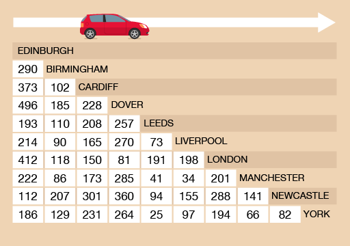
So what exactly do they mean by connectivity, and how are we meant to interpret that magical diagram? Let’s start at the top. The upper panel is what we call an “adjacency matrix”, but you can think of it just like one of those mileage charts that you sometimes see in the corner of highway maps.
A mileage chart, which you can read in the same way as the adjacency matrix above. If you want to get between two points, just find the intersection between your row and column of choice. 290 miles from Birmingham to Edinburgh doesn’t sound too bad, until you encounter the menace that is Birmingham traffic… [Source: The Open University]Instead of looking at the distance between two points like in a mileage chart, the authors of the reef paper consider the likelihood of water travelling from one point to another. Darker squares show a higher chance of connection, and lighter squares, a lower chance. For instance, if we look at the first column, water is more likely to flow from the point they call “WT FR NW” to point “WT W” than it is to flow to “WT FR SW”.
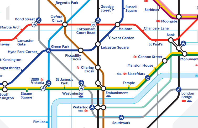
The second panel shows the same information as the matrix, but this time actually showing the connections on a map – a “network diagram”. The thickness of the blue lines on the network diagram indicate how strong a connection between two points is. If all this seems rather familiar, then that’s probably because you’ve already met our network diagram’s more famous cousin, the transit map:
Harry Beck’s famous map of the London Underground. This map is a network diagram, much like the coral atoll connectivity map shown earlier. It represents the stations as nodes, and the train lines between them as links. It shows the connections symbolically, rather than at their true geographical locations, but this makes it easier for use to focus on the important things, like knowing where we need to switch train lines to get back to our hotel. [Source: Transport for London]
Cool maps. So what?
After seeing the coral reef connectivity diagram, I started googling and soon realized that I had been woefully ignorant of an entire mathematical discipline. Network theory represents complex systems as a series of points and the links between them. Once you’ve done that, interesting patterns start to emerge, such as the “six degrees of separation” or “small-world” phenomenon. It has been used in neurology, sociology, ecology, epidemiology, geomorphology, and basically every kind of “-ology”, except for coastal science and engineering. As far as I can tell, we seem to be the last ones to the party.
The more I read, the more excited I became, and the more vital it seemed for our field to catch up. Connectivity could help us quantify and bring order to the chaotic spaghetti churned out by our models and measurements – if we could figure out how to adapt it.
The course of my PhD was changed instantly with the discovery of that figure. Not only did connectivity provide a potentially useful tool, but it jolted me out of my funk and got me excited about my PhD again. It was an important finding for my research but not a “eureka moment” where everything was suddenly solved- far from it. It has been a long uphill slog since then, but with the help of some very clever people, I think we have almost reached our first milestone. We presented our early findings at a conference in 2017, and right now we’re in the final stages of preparing a scientific article about our ideas. That paper will then have to survive the woodchipper of peer-review, so it may still be many months before my work sees the light of day. But I remain hopeful.
Would I have stumbled upon connectivity eventually, had I not seen The Magic Figure? Probably not if I had only stuck to reading papers about coastal sediment transport. This finding has shaped my attitude towards coastal engineering research- I believe that the next advances in our field will not come from developing a new bedload equation, but from adopting new tools and techniquesfrom other disciplines. Not that we don’t need better bedload equations – I just don’t think I’m the guy to do it, and I think that we could all benefit from looking over the fence at our neighbours in other fields from time to time. As William Zinsser nicely put it:
“Think flexibly about the field you’re writing about. Its frontiers may no longer be where they were the last time you looked.”