In an era of rising sea levels, ambitious plans for coastal protection works are emerging around the world. One such plan is the Delta21 project, proposed by group of Dutch coastal engineers and entrepreneurs. Their goal is to improve flood protection at the mouth of the Haringvliet estuary and develop a tidal power facility, all in one integrated project.
However, the law of unintended consequences often looms large in these sorts of massive infrastructure projects, particularly for environments as complex as estuaries. After a massive flood in 1953, the Dutch constructed the Delta Works, damming most of the estuaries in the southern half of the Netherlands. Prior to that, the Afsluitdijk was constructed across the Zuiderzee in the northern part of the country. These protection works have had dramatic consequences on the physical and ecological development of the Dutch coast, and manyofmycolleagues here have devoted their careers to analyzing the impact of these interventions.
But instead of just looking back and dissecting the successes and failures of 50 or 100 years past, what if we could also use our latest diagnostic tools for predicting the potential impact of bold future interventions? If the Delta21 plan goes ahead, how will the mouth and ebb-tidal delta of the Haringvliet estuary and surrounding coastline evolve? Will existing habitats (particularly in vital intertidal areas) be preserved, disappear, or even expand?
Today, Mayra Zaldivar Piña tackled these questions head on, and successfully defended her master’s thesis, “Stability of intertidal and subtidal areas after Delta21 plan“. I had the pleasure of co-supervising Mayra’s work throughout the last eight or so months, and am very proud of her. She embarked on a challenging modelling project and showed an exemplary critical scientific attitude. I was also so impressed with the persistence and tenacity she showed in doing nearly her entire project during the pandemic. Writing your thesis is a difficult and isolating experience at the best of times, and these are not the best of times. Nonetheless, she kept at it and delivered an impressive thesis in the end!
Congratulations Mayra, and best of luck in the next steps of your career!
Three years ago, I experienced one of the highlights of my professional career so far. Alongside researchers from 3 universities, the Dutch government, and several other institutions, we carried out a 40-day field measurement campaign at Ameland Inlet in the north of the Netherlands. We deployed several frames loaded up like Christmas trees with every instrument imaginable: ADVs and ADCPs to measure waves and currents, LISSTs and OBSs to measure suspended sediment, a YSI multiprobe to measure salinity and other water quality indicators, and even a 3D sonar to track the migration of ripples along the seabed.
One of the five measurement frames that we deployed in Ameland back in Fall 2017. It was stacked full of instruments to measure the waves, currents, suspended sand and mud, salinity, ripples, and more.
Four of our five frames survived the relentless ebb and flow of the tide, and even two major storms (one of which left me stranded in Germany after the wind blew down all the overhead train power lines between Berlin and Amsterdam!). In the end, we obtained enough data to keep me busy for probably 3 PhDs, if not the rest of my career. This is just as well, since that last frame was buried in the storm, and based on our understanding of the local dynamics, it will likely re-emerge in another few decades, just in time for my retirement! I look forward to sharing my other findings with you here in the next few months!
Although it used to be the norm for scientists to squirrel away their data, there is an increasing movement towards open accessibility of research data. This improves transparency and accountability in the scientific process, and opens up new opportunities for collaboration. The data we collected is now available in its entirety here on the 4TU web portal or on Rijkswaterstaat’s interactive web viewer.
However, there is a lot of data – I mean A LOT! To help researchers interpret the contents of this database, we prepared an overview paper, which was finally published in the journal of Earth System Science Data! It is also accompanied by a more detailed report, which gets into the nitty-gritty details we didn’t have room to describe in the paper. Nobody likes to read a phonebook-sized report, but it’s nice to have the information there for the few brave souls who do want to comb through our dataset.
Sailing across the Vlie ebb-tidal delta on our way to retrieve the measurement frames at the end of the field campaign.
It was all a huge team effort, as evidenced by the 20+ co-authors. My contribution to this paper focused on the processing of the LISST and YSI multiprobe data, which tell us about the size of particles floating through the water, and how salty that water is. I also designed the maps. As a kid, I loved to read and draw maps, and I think that 7-year-old Stuart would have been tickled to know that he would still be dabbling in cartography all these years later.
As the research in the rest of my PhD (and beyond!) will continue to focus on the fruits of this measurement campaign, I am very keen to work together and collaborate with other researchers who have an interest in this dataset. Please get in touch if you are interested!
Small island developing states around the world are especially vulnerable to the hazards posed by sea level rise and climate change. As engineers, we have a number of tools in our toolbox for reducing the risk posed by coastal flooding and for planning adaptation measures. We often rely on predictive models which combine information about expected wave and sea level conditions, the topography of the coast, and vulnerable buildings and population to estimate potential flooding and expected damage.
However, to use these types of models, we first need to answer a lot of questions: what exactly are the expected wave and sea level conditions? What if detailed topographic measurements are unavailable? What if the population of a given coastal area increases? How are the local buildings constructed, and what are the consequences of that for estimating damage from flooding?
If our information is imperfect (which it almost always is), all is not lost: we can still make educated guesses or test the sensitivity of our models to a range of values. However, these uncertainties can multiply out of control rather quickly, so we need to be able to quantify them. There is no sense in spending the time to develop a detailed hydrodynamic model if your bathymetry data is crap. Can we get a better handle on which variables are the most important to quantify properly? Can we prioritize which data is the most important to collect? This would help us make better predictions, and to make better use of scarce resources (data collection is expensive, especially on remote islands!).
Based on a study of the islands of São Tomé and Príncipe, off the coast of Africa, Matteo found that topographic measurements and the relationship between flood depth and damage to buildings were the biggest uncertainties for predicting present-day flood damage. This means that measuring topography of vulnerable coastal areas in high resolution, and performing better post-disaster damage surveys will provide the best “bang for your buck” right now. However, for longer time horizons (i.e. the year 2100), uncertainty in sea level rise estimates become most important.
Matteo’s work will help coastal managers on vulnerable islands to better prioritize limited financial resources, and will improve the trustworthiness of our predictive models. Great job, Matteo!
Coral reefs around the world are dying; that much is clear from the headlines we see in the news that grow increasingly distressed with each passing year. This is an ecological catastrophe, but are we also losing another key benefit of reefs? Coral reefs provide a form of natural protection against wave-driven flooding on tropical coastlines. This is partly because the physical form of the reef (often a big rocky shelf) serves as a sort of natural breakwater, but is also due to the frictional effects of the corals themselves.
Many species of coral have complex shapes that disrupt the flow of water across reefs, generating turbulence and dissipating energy. This has the effect of reducing the height of waves as they travel across the reef towards the shore. However, these effects are incredibly complex and poorly understood, so we usually just simplify them in our predictive models by considering a reef to be more “hydraulically rough” than a sandy beach, for example. But we need to do better: these models are used to forecast flooding and estimate the impact of future climate change on vulnerable coasts.
How can we improve this? In coastal engineering, we often conduct experiments in the laboratory to test our theories and understand the chaos of natural systems in more controlled settings. What if we could make a scale model of a coral reef and measure exactly how waves are dissipated?
I am extremely proud to announce the graduation of Paul van Wiechen, one of the Master’s students whom I have had the pleasure of supervising. Yesterday, he defended his thesis, “Wave dissipation on a complex coral reef: An experimental study“, where he built a tiny coral reef in the TU Delft wave flume (a 30-m long bathtub with a wave-making paddle at one end) using hundreds of 3D-printed coral models.
It was one of the coolest projects I have ever seen, and his research provides us with valuable measurements that give us a deeper understanding of the vital role that corals play in protecting our coasts.
He also did all of this in the middle of a global pandemic, and somehow managed to stay completely on schedule. We are very lucky, because Paul will be joining the Coastal Engineering department here at TU Delft to start a PhD on dune erosion this fall. We are all glad to have him on the team and eager to see what his research unveils next!
Many of the world’s idyllic tropical coasts are facing threats on multiple fronts. Rising seas threaten the very habitability of many low-lying islands, and the coral reefs that often defend these coasts from wave attack are dying, too. Compounding this problem is the sheer number and variety of these islands: there are thousands of islands, and the coral reefs surrounding them come in all shapes and sizes. Located around the globe, these islands are each exposed to a unique wave climate and range of sea level conditions. This variability in reef characteristics and hydrodynamic forcing makes it a big challenge to forecast how waves will respond when they approach the shore, something that is quite tricky even at the best of times. Under these circumstances, how can we protect vulnerable coastal communities on coral reef coasts from wave-driven flooding?
This is the problem that our fantastic former student, Fred Scott (now at Baird & Associates in Canada), tackled in his paper, Hydro-Morphological Characterization of Coral Reefs for Wave Runup Prediction, recently published in Frontiers in Marine Science. Working in partnership with Deltares and the US Geological Survey for his master’s thesis, Fred came up with a new methodology for forecasting how waves transform in response to variations in the shape and size of coral reefs.
(A) This is a typical fringing coral reef cross-section, showing waves approaching from the right, with the shore on the left. (B) Fred came up with a number of algorithms for classifying and organizing the massive dataset of coral reef cross-sections. (C) The measurements used in our study are from sites around the globe. (D) This is what 30,000 reef cross-sections look like when you try to plot them all on top of one another- clearly we need to whittle those down a bit… [Source: Scott et al, 2020]In our previous research on this topic, we tried to predict flooding on coral reef-lined coasts using a very simplified coral reef shape. This was fine as a first guess, but most reefs are bumpy and jagged and bear little resemblance to the unnaturally straight lines in my model. We couldn’t help it though: there just wasn’t enough data available when I started my thesis four years ago, so we did the best we could with the information we had at the time. On the bright side, using a single simple reef shape meant that we could easily run our computer simulations hundreds of thousands of times to represent a wide range of wave and relative sea level conditions.
Fast forward three years to when Fred began his own thesis. We now had access to a mind-boggling dataset of over 30,000 measured coral reef cross-sections from locations around the world! However, instead of too little data, we now had too much! If we wanted to simulate a whole range of wave and sea level conditions on each of the reefs in our dataset, it might take months or even years to run our models! Fred had the daunting task of distilling that gargantuan database down to a more manageable number of reef cross-sections.
But how do we choose which cross-sections are the most useful or important to look at? Even though every coral reef is, like a beautiful snowflake, utterly unique, surely there must be some general trends or similarities that we can identify, right? This question lies at the heart of Fred’s research, and to answer it, he turned to many of the same powerful statistical and machine-learning techniques used by the likes of Google and Facebook to harvest your life’s secrets from the internet or power self-driving cars. Maybe we can use some of this technology for good, after all!
The main approach that Fred used in this study was cluster analysis, a family of techniques that look for similarities or differences between entries in a dataset, and then group the entries accordingly into clusters. The entries within one cluster should be more similar to each other than to the entries in other clusters. In our case, this meant grouping the reefs into clusters by similar shape and size. This allowed us to increase efficiency and reduce redundancy by proceeding with 500 representative cross sections, instead of the entire database of 30,000.
These days when I’m lonely, I Zoom with 500 of my favourite coral reef profiles…
Other studies in our field have tried similar approaches (such as this Brazilian study of coral reef shape), but the innovative part of Fred’s technique was to also account for similarities in the hydrodynamic response of the waves to each reef via a second round of clustering. Wave transformation on coral reefs can be immensely complicated, so it is entirely possible that two reef profiles could look very different, but lead to the same amount of flooding in the end. Since we are mainly concerned about the flooding (rather than a classification for ecological or geological purposes about coral reef formation and evolution), this suits us just fine!
In the end, Fred was able to distill this colossal dataset into between 50-312 representative cross sections that can forecast wave runup with a mean error of only about 10%, compared to predictions made using the actual cross sections. This opens the door wide for a range of future applications, such as climate change impact assessments or coral reef restoration projects. Right now, we are working on a new project that will apply Fred’s approach to the development of a simplified global early-warning system for wave-induced flooding on coral reef-fronted coasts.
Great work, Fred, and congratulations on your first publication! I am excited to see where this road takes us!
Sources:
Scott, F., Antolinez, J.A.A., McCall, R.C., Storlazzi, C.D., Reniers, A.J.H.M., & Pearson, S.G. (2020). Hydro-morphological characterization of coral reefs for wave-runup prediction. Frontiers in Marine Science. [Link]
Scott, F. (2019). Data reduction techniques of coral reef morphology and hydrodynamics for use in wave runup prediction. [Link]. TU Delft MSc thesis in cooperation with Deltares and the US Geological Survey.
Scott, F., Antolinez, J.A., McCall, R.T., Storlazzi, C.D., Reniers, A., and Pearson, S., 2020, Coral reef profiles for wave-runup prediction: U.S. Geological Survey data release [Link].
What pathways does sediment take as it travels through an estuary? Yesterday, Laurie van Gijzen defended her thesis, entitled “Sediment Pathways and Connectivity in San Francisco South Bay“. Laurie is one of the master’s students that I supervise, and she has done a great job on this project.
San Francisco Bay is a massive estuary, with over six million people living nearby. In addition to San Francisco, Silicon Valley sits on its shores. Some of the biggest tech companies in the world like Google and Facebook have their head offices right next to the Bay. For over 150 years, the ecological health of the bay has deteriorated, in part due to land reclamations and contaminated sediment from gold mining. The dynamics of San Francisco thus have a huge economic, social, and environmental impact.
Laurie’s work focused on calibrating and improving a sediment transport model of the bay, in order to track the pathways of fine sediment (i.e., mud). She worked with a notoriously fickle model (DELWAQ) and succeeded in greatly improving its calibration.
Laurie’s thesis summarized into a single diagram (Figure 6.1 from her report). She shows the dominant sediment pathways as dark arrows, and the net accumulation (import, in orange) or depletion (export, in blue). Also indicated are the dominant physical processes responsible for sediment transport in the different parts of the bay. The baroclinic processes mentioned here are currents resulting from density differences in seawater due to changes in salinity and temperature.
Another cool thing about her work is that Laurie was the first person to apply the coastal sediment connectivity framework that I have been developing! She was able to use this to identify key transport pathways and critical locations in the bay. It was extremely helpful for my research, as it gives us a proof of concept that our framework is applicable to multiple sites and can tell us something useful.
Her work was also accepted for a presentation at the NCK Days conference, which was meant to be held this week in Den Helder, but was cancelled due to ongoing societal chaos. Great job, Laurie!
It was Christmas 2016, and I felt like I had bitten off more than I could chew. I’m not talking about turkey, though. Four months into my PhD, I was feeling completely overwhelmed and starting to wonder what I had gotten myself into.
The goal of my project is to identify the pathways that sand takes as it moves in and around the Wadden Islands in the northern part of the Netherlands. Since the Dutch coast has a chronic erosion problem, accurately accounting for the whereabouts of their sand is a matter of national security. Right now, the Dutch deal with a deficit in their coastal sediment budget by adding more sand or “nourishing” wherever there is a shortfall.
Knowing when, where, and how much sand to add is especially challenging around these islands. Here, the persistent push and pull of the tide competes with the chaotic brutality of the waves to move sediment in complex patterns. These patterns are hard to predict with our usual box of tools, so we planned to throw everything we had at the problem: state-of-the-art field measurements, sophisticated computer models, reams of historical data, and a support team of experts from across the Netherlands. As PhD students go, I felt [and still feel!] pretty darn lucky to be a part of such a large and well-conceived project.
The Spaghetti Problem
However, as I started reading more and more about my topic, my initial enthusiasm began to wane. I was floored by just how much research had already been done on what I had thought was a fairly specific niche. The Dutch have been scrutinizing their coast for centuries, and to my inexperienced eyes, it seemed like they had already thought of everything.
There was another problem: at the end of almosteverystudyaboutsedimentpathways, there seems to be a diagram summarizing all the paths with lots of curvy arrows flying all over the place. This veritable plate of spaghetti makes for a nice conceptual drawing, but how can you statistically compare two plates of spaghetti with one another? A “past spaghetti” and a “future spaghetti”, to help understand potential responses to climate change? A “Dutch spaghetti” and an “American spaghetti”, to make my findings more general and useful for other places? If I was going to get anywhere with my PhD, I needed a spaghetti system.
Mmm, sediment pathways… Also, to be clear, this is not The Magical Figure That Single-handedly Changed My PhD. [Source: Flickr]By Christmas, I felt like I was in a weird purgatory between “it’s all been done before! I’ll never come up with anything original!” and “this is insurmountably complex and you’re foolish to think you’ll ever figure this out”. And just a dash of “how-did-I-get-here?” imposter syndrome, for good measure. I spent much of my holiday feeling overwhelmed and inadequate, like I couldn’t possibly live up to my own expectations, or (what I thought to be) the expectations of those around me.
But: new year, new start. On January 11th, 2017, my first day back in the Netherlands from holidays, a paper about coral reef hydrodynamics popped up in my Google Scholar alerts. At that time, I was also finishing up a paper about predicting floods on tropical islands, and I liked to keep an eye on the latest developments in that topic.
“A coupled wave-hydrodynamic model of an atoll with high friction: Mechanisms for flow, connectivity, and ecological implications“. Sounds promising, I like wave models.
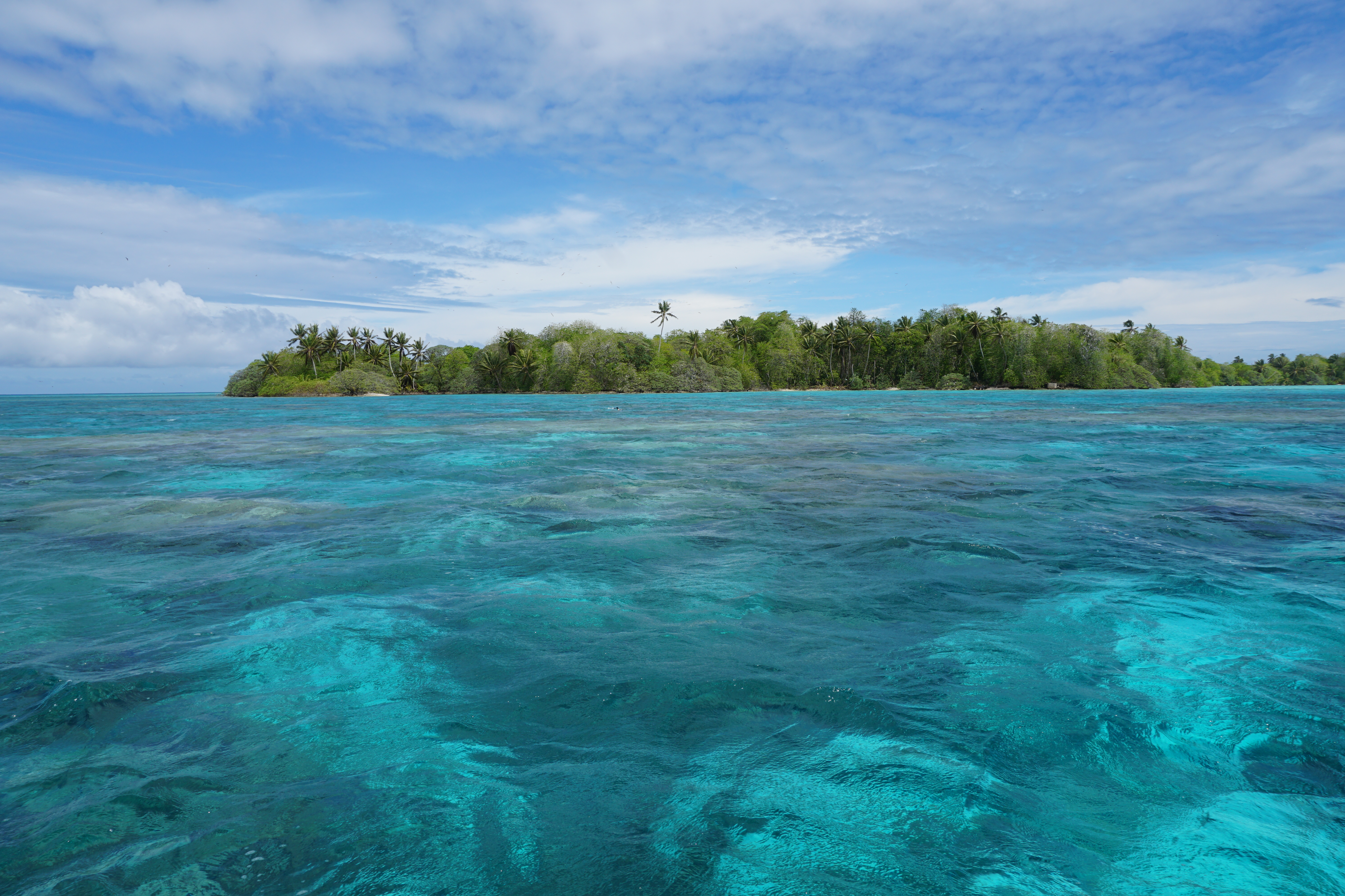
In this paper, they wanted to understand how waves and ocean currents move water around Palmyra Atoll, a coral island in the middle of the Pacific. Coral reefs all around the world are in big trouble, and to help them we must first understand the physical processes governing the life and death of corals.
Palmyra Atoll, a coral island in the middle of the Pacific. Unfortunately not my PhD study site… [Source: Wikipedia]This was all very interesting stuff, though not particularly relevant to my research about flood prediction, since they seemed more focused on the ecological impact of their results. It was seemingly even less relevant to my PhD topic on Dutch sand- stay focused and stop wasting your time, Stuart! But then I turned the page and there it was:
The Magical Figure That Singlehandedly Changed My PhD…
The Magical Figure That Singlehandedly Changed My PhD, Figure 13 from Rogers et al (2017). “Connectivity between hydrodynamic zones. (a) connectivity matrix showing the probability a water parcel passing through a destination zone came from a given source zone, and (b) geographic connectivity of top 10% of pathways, where shading is relative importance as an overall source, width of line is relative strength of connection.”
Essentially, the authors had summarized the pathways that coral larvae can take around an island in a mathematically elegant way. This was pretty much identical to the goal of my PhD, if you substitute coral larvae for sand, and an idyllic Pacific island for a stormy estuary in Holland. They did it with a concept called “connectivity”, and it became immediately apparent that I had some homework to do.
So what the heck is connectivity?
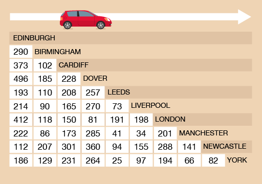
So what exactly do they mean by connectivity, and how are we meant to interpret that magical diagram? Let’s start at the top. The upper panel is what we call an “adjacency matrix”, but you can think of it just like one of those mileage charts that you sometimes see in the corner of highway maps.
A mileage chart, which you can read in the same way as the adjacency matrix above. If you want to get between two points, just find the intersection between your row and column of choice. 290 miles from Birmingham to Edinburgh doesn’t sound too bad, until you encounter the menace that is Birmingham traffic… [Source: The Open University]Instead of looking at the distance between two points like in a mileage chart, the authors of the reef paper consider the likelihood of water travelling from one point to another. Darker squares show a higher chance of connection, and lighter squares, a lower chance. For instance, if we look at the first column, water is more likely to flow from the point they call “WT FR NW” to point “WT W” than it is to flow to “WT FR SW”.
The second panel shows the same information as the matrix, but this time actually showing the connections on a map – a “network diagram”. The thickness of the blue lines on the network diagram indicate how strong a connection between two points is. If all this seems rather familiar, then that’s probably because you’ve already met our network diagram’s more famous cousin, the transit map:
Harry Beck’s famous map of the London Underground. This map is a network diagram, much like the coral atoll connectivity map shown earlier. It represents the stations as nodes, and the train lines between them as links. It shows the connections symbolically, rather than at their true geographical locations, but this makes it easier for use to focus on the important things, like knowing where we need to switch train lines to get back to our hotel. [Source: Transport for London]
Cool maps. So what?
After seeing the coral reef connectivity diagram, I started googling and soon realized that I had been woefully ignorant of an entire mathematical discipline. Network theory represents complex systems as a series of points and the links between them. Once you’ve done that, interesting patterns start to emerge, such as the “six degrees of separation” or “small-world” phenomenon. It has been used in neurology, sociology, ecology, epidemiology, geomorphology, and basically every kind of “-ology”, except for coastal science and engineering. As far as I can tell, we seem to be the last ones to the party.
The more I read, the more excited I became, and the more vital it seemed for our field to catch up. Connectivity could help us quantify and bring order to the chaotic spaghetti churned out by our models and measurements – if we could figure out how to adapt it.
The course of my PhD was changed instantly with the discovery of that figure. Not only did connectivity provide a potentially useful tool, but it jolted me out of my funk and got me excited about my PhD again. It was an important finding for my research but not a “eureka moment” where everything was suddenly solved- far from it. It has been a long uphill slog since then, but with the help of some very clever people, I think we have almost reached our first milestone. We presented our early findings at a conference in 2017, and right now we’re in the final stages of preparing a scientific article about our ideas. That paper will then have to survive the woodchipper of peer-review, so it may still be many months before my work sees the light of day. But I remain hopeful.
Would I have stumbled upon connectivity eventually, had I not seen The Magic Figure? Probably not if I had only stuck to reading papers about coastal sediment transport. This finding has shaped my attitude towards coastal engineering research- I believe that the next advances in our field will not come from developing a new bedload equation, but from adopting new tools and techniquesfrom other disciplines. Not that we don’t need better bedload equations – I just don’t think I’m the guy to do it, and I think that we could all benefit from looking over the fence at our neighbours in other fields from time to time. As William Zinsser nicely put it:
“Think flexibly about the field you’re writing about. Its frontiers may no longer be where they were the last time you looked.”
The main protective barrier for the Netherlands against the threat of flooding from the sea is a row of colossal sand dunes and wide beaches that stretch the length of their coast. However, that barrier is not completely natural — since the Dutch coast is in a constant state of erosion, the sand in their coastal zone has to be continually replenished. This replenishment takes the form of nourishments, which are essentially just massive piles of sand placed on beaches, dunes, or just offshore. The Dutch are lucky, since the bottom of the North Sea is covered in sand for hundreds of kilometers in every direction, meaning that there is a ready supply available for this purpose.
Although we still have plenty to learn about how to construct these nourishments effectively and in an environmentally friendly way, we are starting to get the hang of it — at least for long, straight, sandy coastlines like in Holland. However, this all gets a bit trickier when we turn our attention to the Wadden Islands dotting the northern coast of the Netherlands. These little islands sit between the stormy North Sea and the shallow Wadden Sea, a large estuary whose ecological value is unmatched in the Netherlands.
The coast of these islands is punctuated by a series of inlets connecting the two seas. Chaos reigns at these inlets, where strong tidal currents pass in and out, clashing with waves and whisking sandy shoals in and out of existence in unpredictable ways. This makes the inlets treacherous for ships, but also a challenge to simulate with our computer models and design nourishments for.
How, then, are are we meant to nourish the coast of these islands? We want to keep their inhabitants (and those on the nearby mainland) safe from flooding, but also need to be careful about inadvertently disrupting the vital ecological habitat of the Wadden Sea.
To answer that question, the Dutch government initiated the Kustgenese or Coastal Genesis project. In collaboration with several Dutch universities, companies, and research institutes, they set out to better understand how these tidal inlets work, and whether it is possible to effectively nourish them. The project focuses on Ameland Inlet, which is located between the islands of Ameland and Terschelling.
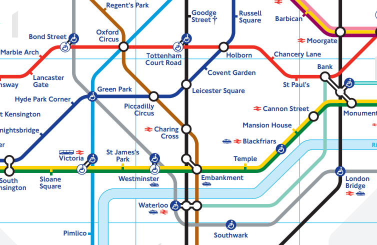
My PhD project is but a very tiny piece of the very large Kustgenese pie. My goal is to figure out specifically how the size of sand grains affects the paths that they take around tidal inlets. It has been the dream job for someone who has loved playing in the sand ever since he was a little kid. As a result, it has entailed a lot of time at my computer and in the laboratory, investigating the characteristics of the sand in Ameland inlet (that’s also why I have so many pictures of sand on this blog- we have a really cool microscope!). It is very fine sand and would be absolutely perfect for squidging your toes through on a hot day — if it weren’t at the bottom of the sea, that is:
Native sediment from Ameland ebb-tidal delta
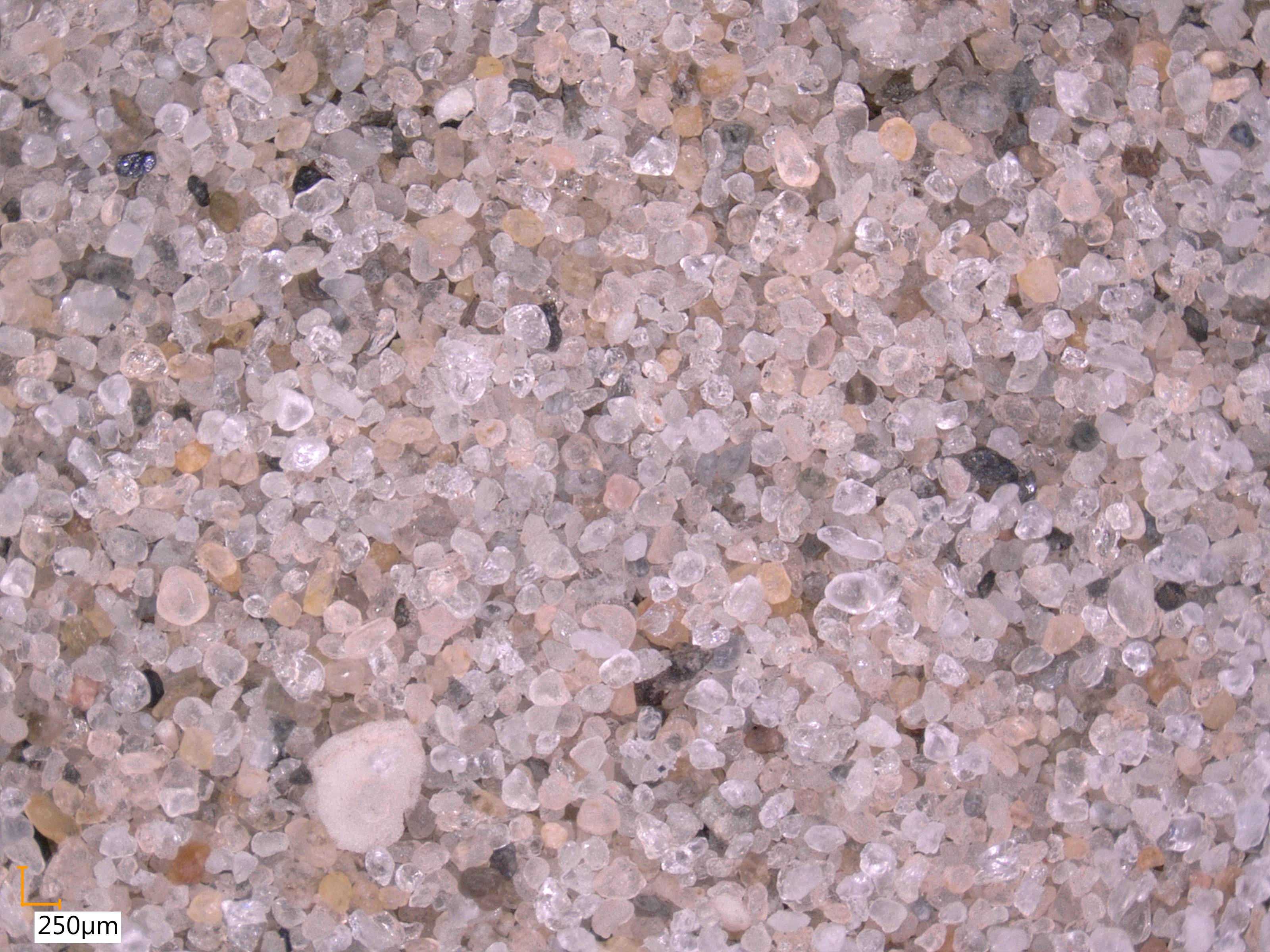
In the spirit of ‘why not?’, the Dutch government decided that the best way to test whether nourishments would be effective in this environment was to just go ahead and try one out last year. They dredged up 5 million cubic metres of sand (that’s enough to fill 3 Skydomes, for anyone reading this back home in Toronto) and placed them just outside the inlet. A few months ago, one of the Dutch government officials showed up at a meeting with a “present” for me… some sand from the nourishment!
Nourishment sediment dredged from offshore and placed on Ameland ebb-tidal delta.
Needless to say, I was very excited. At first glance, it appears quite similar to the native sediment, so that means it should behave in a similar manner. Time will tell how the nourishment evolves- we are watching very closely!
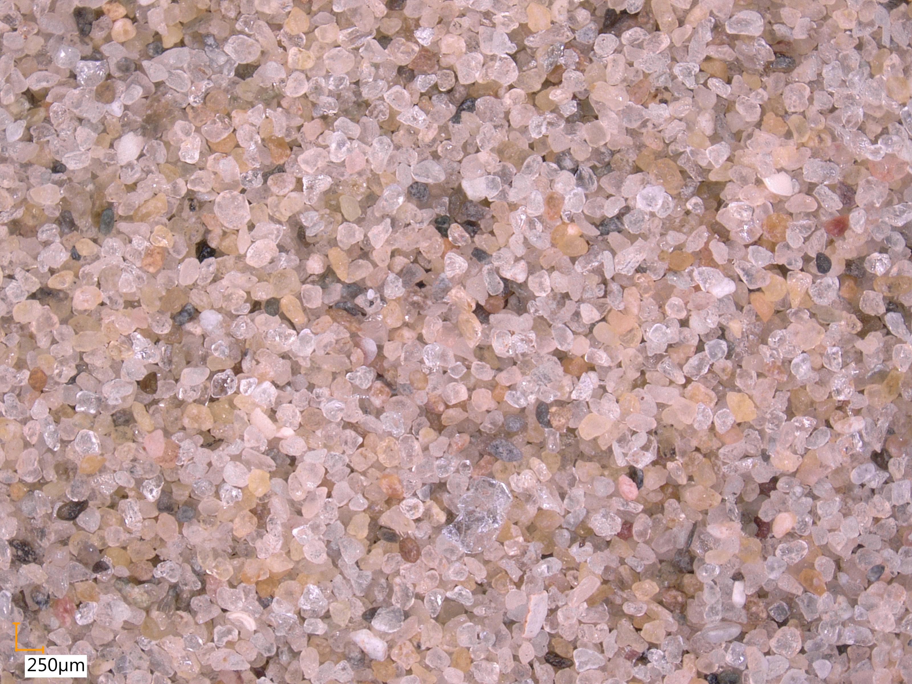
I have spent many months holed up in the laboratory counting green grains of sand. Last year we dumped over 1 ton of fluorescent, magnetic tracer sand into the North Sea, where the waves and tides then scattered them along the coast. We then spent the following weeks circling around on a boat to try and find it all again. We scooped up over 200 samples of sand from the seabed, then brought them back to the lab for analysis. We used a super strong magnet and blue UV light to separate the tracer (bright green) from the normal sand (looks grey or purple under UV light). This part is REALLY boring because most samples don’t have any tracer but we still have to look hard for it . But then we get to look at all the sand under a fancy microscope, which is my new favourite toy! Under the UV light, the tracer reminds me of little green constellations of stars in a purple night sky.
The tracers glow bright green under ultraviolet lights. On the top left we have a jar of normal beach sand sitting next to a jar of tracer. The distinction becomes clear once we place them under UV illumination (top right). This is especially important when we analyze samples taken from the seabed, where there may be only a few grains of tracer (bottom left). The fluorescent properties of the tracer help it stand out from normal sand (bottom right), which lets us count the individual grains.
Fortunately, we can use computers to count the individual grains and tell us their size. With this information, we can estimate how the size of a sand grain determines how far and fast it will travel. This is important for planning sand nourishments to protect the coast.
If we can figure out where the green tracer did (or didn’t) go, that will tell us how normal sand moves around on the Dutch coast. And this will hopefully keep our feet dry here in Delft for a long time to come!